Eine gute Surface Map ist für ein überzeugendes Bild ebenso wichtig wie die passende Atmosphäre oder ein ansprechendes Terrain. Durch sie bekommt die Landschaft sozusagen den farbigen Anstrich. Wie man eine Surface Map anlegt, möchte ich hier nur fundamental ansprechen, weil es dazu schon reichlich gute Anleitungen gibt - z. B. bei Terra-Dreams. Ich möchte hier mehr die einzelnen Schalter bzw. Regler und deren Feinheiten behandeln, die bei der Erstellung der Suface Map gerne übersehen werden.
Die nachfolgenden Minibilder können durch einen Klick vergrößert angezeigt werden. Sie öffnen sich alle in einem neuen Fenster.
Zunächst jedoch erst einmal drei grundsätzliche Dinge:
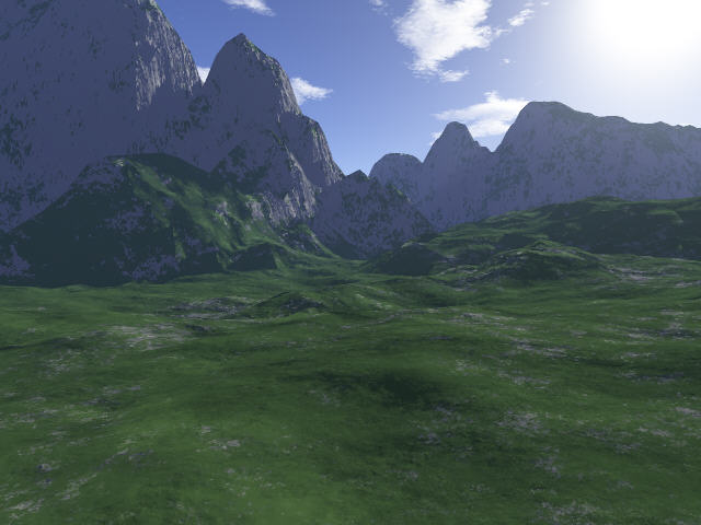
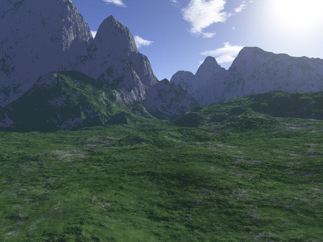
1. Der Lichteinfalls-Winkel: Da das Bumpiness prinzipiell duch eine Licht-/Schatten-Wirkung erzeugt wird, ist der Lichteinfall hier ebenso wichtig wie für die Erscheinung des gesamten Terrains. Man sollte nach Möglichkeit vermeiden, daß Teile der Landschaft frontal angestrahlt werden, weil frontales Licht die Bildung von Schatten verhindert.
Erfaßt die Kamera lediglich Berge in Blickrichtung, kann man recht gut mit Halblicht arbeiten, soll heißen, man läßt das Sonnenlicht von der Seite einstrahlen. Die Höhe der Sonne spielt in diesem Fall nicht die große Rolle. Anders sieht es aus, wenn die Kamera auch Berge seitlich zur Blickrichtung erfaßt. Dadurch bekommen diese dann Frontal-Licht. In solchen Fällen habe ich sehr schöne Ergebnisse durch Gegenlicht oder seitlichem Gegenlicht mit hochstehender Sonne erzielen können. Das Gegenlicht erzeugt schöne Licht-/Schatten-Spiele auf den seitlichen Bergen, und durch das hochstehende Sonnenlicht werden auch die Strukturen eines Berges in Blickrichtung ordentlich herausmodeliert.
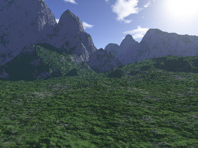
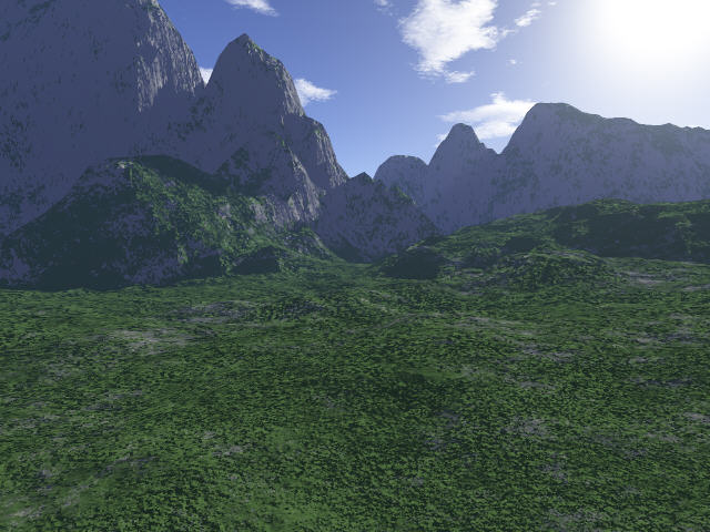
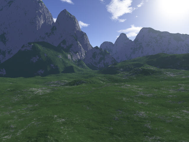
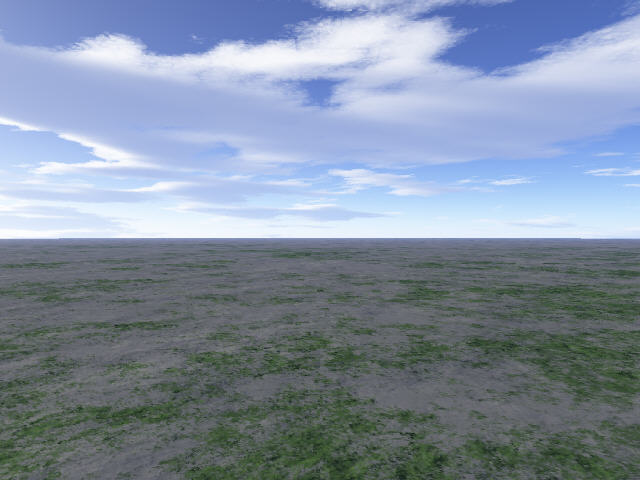
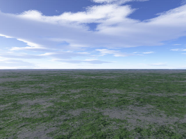
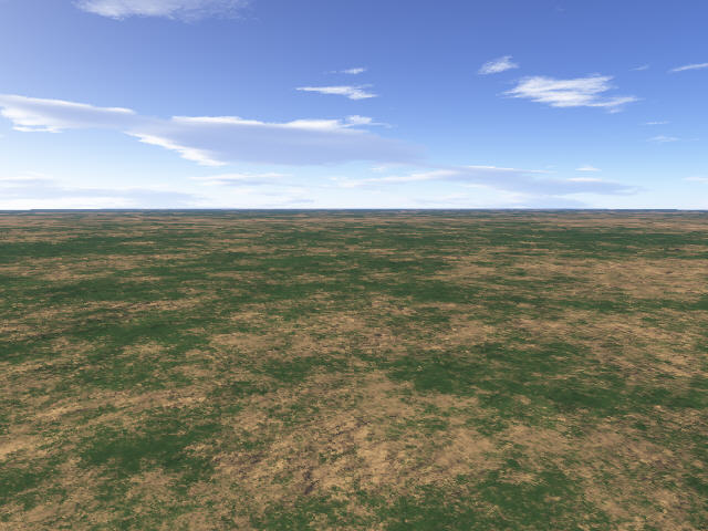
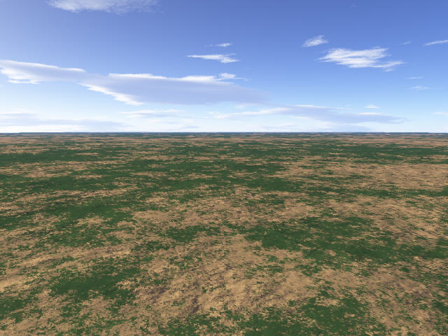
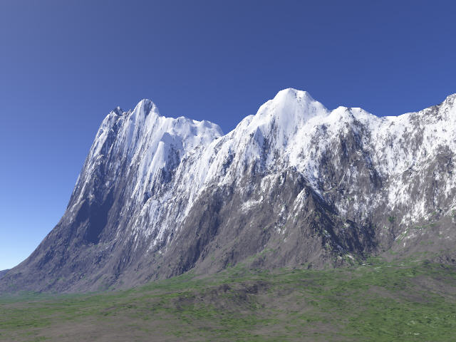
Nachfolgende Bilder zeigen sehr schön die Bedeutung des Lichteinfallwinkels:
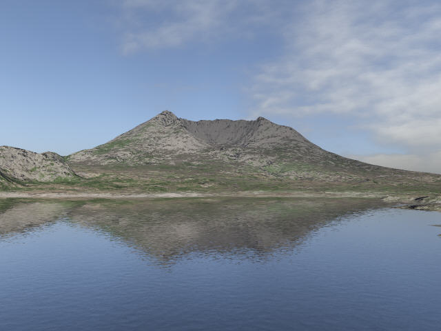 |
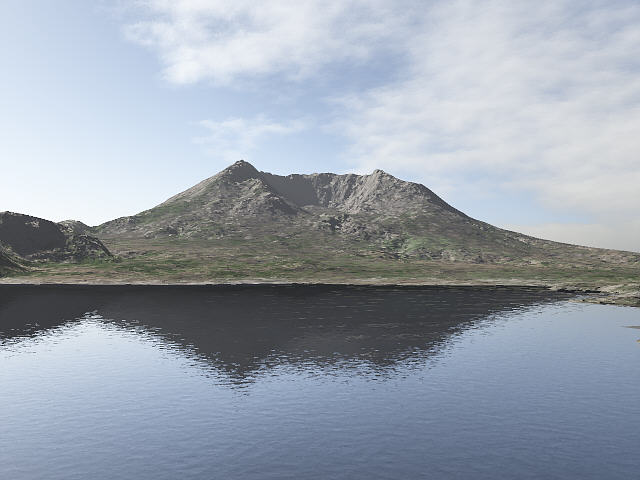 |
| Bei diesem Bild steht die Sonne ziemlich exakt hinter der Kamera. Die Strukturen der Landschaft verschwinden fast völlig. | Hier strahlt die Sonne von Links mit leichtem Gegenlicht ein. Die Strukturen der Landschaft und der Surface Map kommen ausgezeichnet zur Geltung. |
2. Die Wahl der Farben: Diesem Punkt kommt ebenfalls eine ganz besondere Bedeutung zu. Da kann die Surface Map von der Struktur noch so gut sein, wenn die Farben falsch gewählt werden, erhält das Bild nie die Ausstrahlung, die wir ihm eigentlich geben möchten. Es lohnt sich, den Farben die größtmögliche Sorgfalt zukommen zu lassen.
Wenn man sich in der Natur orientiert, wird man feststellen, daß dort kaum reine knallige Farben vorkommen. Vielmehr findet man eine große Vielfalt an Mischwerten vor. Bei sehr vielen Bildern, die ich gesehen habe, haben z. B. die Grüntöne für die Vegetation zu viel Grün-Anteile. Allerdings ist es zugegebenermaßen nicht ganz einfach, die richtige Farbe mittels der 3 Schieberegler zu mischen. Auch ist es schwierig, hier hilfreiche Tips zu geben. Man braucht einfach etwas Feingefühl.
Grundsätzlich kann man jedoch sagen: Je näher die Farbwerte der drei Farben beieinander liegen, umso weniger intensiv erscheint ein tendenziell höherer Farbwert. Bei den Grüntönen für Gras, Büsche oder Wälder erzielt man eine realistischere Farbe, wenn der Regler für die rote Farbe sich näher am Grün befindet als das Blau. Ebenso bekommt man für grauen Felsen in der Grundfarbe bessere Ergebnisse, wenn man kein reines Grau verwendet, sondern eine leichte Tendenz zu einer Farbe schafft. Ich benutze für grauen Felsen gerne zum Grün etwas mehr Rot, und dafür etwas weniger Blau. Bei hellgrauen Absetzungen in der Felsstruktur gebe ich dem Grau auch schon mal einen kleinen Schuß Grün hinzu, was verwitterten oder mit Flechten und Moos belegten Felsen gut simuliert.
Überhaupt kann man Farbabstufungen mittels mehrerer Surface Layer sehr gut und realistisch herstellen, indem man für dunkle, mittlere und helle Töne die gleiche Farbmischung verwendet, jedoch durch gleichmäßiges und gleichsinniges Erhöhen oder Vermindern der Farbwerte Helligkeitsdifferenzen schafft.
 |
|
| Für dieses Bild habe ich die Grüntöne mit je gleichen Anteilen von Rot und Blau gemischt. Die Grautöne enthalten gleiche Anteile von Rot, Grün und Blau. Obwohl das Ergebnis sich nicht extrem von dem Bild rechts unterscheidet, wirken die Farben auf dem rechten Bild natürlicher. | Bei diesem Bild haben die Grautöne einen etwas höheren Rotanteil und weniger Blau als Grün und die Grüntöne haben gegenüber dem Blau auch einen etwas höheren Rotanteil. Die Farben wirken sehr realistisch. |
3. Die Bildgröße: Grundsätzlich gilt: Je größer das Bild gerendert wird, um so mehr Details werden sichtbar - sowohl beim Terrain, als auch bei der Surface Map. Dafür sollte man auch bereit sein, mitunter deutlich längere Renderzeiten in Kauf zu nehemen. Bei der unregistrierten Version von Terragen beträgt die maximale Rendergröße 1280 x 960 Pixel. Ich rendere meine Bilder mit der registrierten Version in einer Größe von 3200 x 2400 Pixeln.
| Diese beiden Bilder habe ich zusammen auf einer Ansicht plaziert, um den Unterschied bei der Bildgröße zu demonstrieren. Das linke Bild wurde in 640 x 480 und das rechte in 3200 x 2400 Pixeln gerendert. Beide Bilder wurden auf 400 x 300 Pixel verkleinert und anschließend durch Scharfzeichnen in einem Bildbearbeitungsprogramm optimiert. Trotz der kleinen Ansicht sind auf dem rechten Bild deutlich mehr Details zu erkennen, was sich bei einer Ansicht von 800 x 600 oder 1024 x 768 Pixeln noch mehr verdeutlicht. |
Das Erstellen einer Surface Map
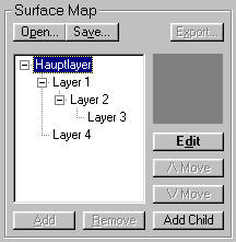 Im Landscape Dialogfenster befindet sich unten rechts der Bereich "Surface Map". Hier werden die einzelnen Layer, die zusammen die Surface Map bilden, angelegt. Die Surface Map verfügt bereits über einen Hauptlayer, bei dem man durch einen Klick auf "Edit" die Farbe, das Bumpiness und das Fractal Noise einstellen kann. Durch einen Klick auf "Add Child" kann man dem markierten Layer (Hauptlayer oder Childlayer) weitere Layer (Childlayer) hinzufügen, welche durch einen Doppelklick oder Klick auf "Edit" bei markiertem Layer in dem sich öffnenden Surface Layer Dialogfenster, in dem sich nachfolgend beschriebenen Schalter und Einstellmöglichkeiten befinden, editiert werden.
Auf diese Art kann man jedem Layer (Childlayer) beliebig viele Childlayer hinzufügen. Dargestellt wird diese Map als Baumstruktur, wobei der unterste Layer in derselben auf der Landschaft zu oberst liegt. Fügt man einem Layer einen Childlayer hinzu, so kann dieser nur an den Stellen in der Landschaft in Erscheinung treten, die durch die Einstellungen bezüglich Coverage, Höhe und Steigung des Parentlayers definiert wurde. Das soll gemäß obigem Beispiel heißen: Layer 2 kann grundsätzlich nur in den Landschaftsteilen sichtbar sein, in denen auch Layer 1 sichtbar ist, und Layer 3 tritt nur dort auf, wo Layer 2 die Landschaft bedeckt. Die Reihenfolge kann durch Klick auf Move up bzw. Move down innerhalb einer Ebene der Baumstruktur veränder werden.
Nachdem wir diese grundsätzlichen Dinge abgeklärt haben, möchte ich mich jetzt in Details der Einstellungen im Surface Layer Dialogfenster auslassen, wobei ich mich zunächst der Erklärung der einzelnen Schalter und deren Auswirkung widme.
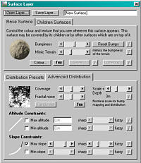 Der obere Teil des Dialogfensters - Registerkarte "Base Surface" ist für die Struktur des Layers zuständig. Das zweite Register "Children Surfaces" enthält zur Zeit nur eine Option und soll in künftigen Versionen von Terragen weitere Optionen zulassen. Daher brauchen wir diesem vorerst keine Beachtung zu schenken.
Im unteren Teil befindet sich die Registerkarte "Advanced Distribution" welche die Verteilung der Farbe aus dem aktuellen Layer regelt. Die Registerkarte "Distribution Presets" beinhaltet wiederum Elemente, die erst in künftigen Versionen zur Verfügung stehen.
Zunächst finden wir oben den Regler Bumpiness: Heißt zu deutsch "Holprigkeit" oder "Unebenheit". Diese Aussage ist eigentlich schon selbsterklärend. Mit diesem Regler bestimmt man also, wie glatt oder uneben der Layer auf unserem Terrain erscheinen soll, bzw. auch wie stark die Unebenheiten sichtbar sein sollen. Aber auch wenn diese Funktion in zwei Sätzen einfach erklärt werden kann, birgt deren Einsatz doch Fehlermöglichkeiten, hängt diese doch mit der Struktur zusammen, die man darstellen möchte. Darauf komme ich aber nochmal zurück, wenn wir uns mit dem Scale + Depth beschäftigt haben. Ebenfalls befinden sich weiter unten auch Beispielbilder, die die Auswirkung des Bumpiness dokumentieren.
Darunter befindet sich der Regler Mimic Terrain: Dieser bestimmt, wie viel von der feineren Grundstruktur des Terrains im aktuellen Layer sichtbar bleiben soll. Die Bedeutung dieses Reglers ist eher untergeordnet, da die Wirkung dieses Effektes oft nicht registriert wird, weil man ein Terrain hat, welches relativ glatte Flächen aufweist. Hat man aber eines, das über viele kleinere Unebenheiten verfügt, ist der Effekt durch Reduzieren oder Erhöhen des Wertes durchaus sichtbar. Sehr häufig kann man diesen Regler in der Voreinstellung belassen. Aber bei der Darstellung von Schnee oder Sand sollte man ihn weiter oder ganz nach links verschieben (reduzieren), da z. B. eine dicke Schneedecke in der Natur die Struktur einer Landschaft oft bis zur Unkenntlichkeit verstecken kann. Und genau diesen Effekt erzielt man mit diesem Regler. Um es nochmal klarzustellen, er hat nichts mit dem eigentlichen Bumpiness des aktuellen Layers zu tun, sondern lediglich damit, wie stark die Unebenheiten der darunter liegenden Landschaft in Erscheinung treten.
Als nächstes folgen zwei Schaltflächen - Colour ... und Tex: Die Schaltfläche Tex möchte ich hier nicht weiter ansprechen, weil sie sich auf den Einsatz von Texturen bezieht. Stattdessen verweise ich hier auf ein enstprechendes Tutorial von Engineer. Durch einen Klick auf "Colour" öffnet sich das Dialogfenster "Surface Colour", in dem man die Farbe für den aktuellen Layer festlegt. Bezüglich der Farbwahl habe ich mich ja weiter oben schon ausgelassen.
Wenden wir uns nun im unteren Teil des Fensters rechts dem Scale + Depth zu: Dieser Regler bestimmt den Maßstab für die Objekte, die wir darstellen wollen und steht in engem Zusammenhang mit dem Bumpiness und würde logisch nach meiner Ansicht besser in den oberen Teil des Dialogfensters passen, aber sei's drum. Scale + Depth beeinflußt die Größe des Bumpiness - sowohl in der flächigen Ausdehnung als auch in der Tiefenwirkung. Zur Verdeutlichung: verschiebe ich diesen Regler weiter nach rechts (erhöhe den Wert), sehen die Bumps größer und höher aus. Verringere ich den Wert, werden sie kleiner und flacher. Es ist fast so, als ob man eine Struktur vergrößert oder verkleinert. Um den Zusammenhang zwischen Bumpiness und Scale + Depth bzw. deren Unterschiede zu verdeutlichen, habe ich nachfolgend einige Beispiele aufgeführt.
 |
 |
 |
| Scale + Depth auf 3,072 Bumpiness auf 1/3 reduziert |
Scale + Depth auf 3,072 Bumpiness auf 50 % |
Scale + Depth auf 3,072 |
 |
 |
 |
|
Scale + Depth auf 0,432 |
Scale + Depth auf 0,432 |
Scale + Depth auf 0,432 Bumpiness auf 100 % |
 |
 |
 |
| Scale + Depth auf 20,172 Bumpiness auf 1/3 reduziert |
Scale + Depth auf 20,172 Bumpiness auf 50 % |
Scale + Depth auf 20,172 Bumpiness auf 100 % |
Wenn Ihr die obigen Bilder aufmerksam betrachtet, könnt ihr schnell feststellen, daß das kleinere Scale + Depth das Gras in einer sehr kleinen Struktur darstellt. Es sieht gleich überzeugender aus, als mit einem großen Scale + Depth. Es eignet sich also hervorragend für kleinere Strukturen wie Gras, Kies oder steiniger Boden, wenn wir - wie in obigem Beispiel - einen ausgeprägten Vordergrund haben und die Kamera nur eine geringe Höhe über der Surface Map aufweist. Die Sichtbarkeit der Struktur nimmt zwar mit zunehmender Entfernung ab, aber das ist ja in der Natur nicht anders. Ein mittleres Scale + Depth - um die 3, 4 oder 5 - läßt sich gut für Felsstrukturen verwenden, da diese Größe auch in größerer Distanz einigermaßen sichtbar bleibt. Ein ausgedehntes Waldgebiet - vor allem aus größerer Höhe oder Distanz betrachtet - erfordert hingegen ein größeres Scale + Depth. Welche Einstellung man wählt, hängt also in starkem Maße davon ab, was man mit einem Layer simulieren möchte (Gras, steiniger Boden, Felsstrukturen oder Wälder oder Schnee) bzw. ob ich bei einer niedrigen Kamera-Position einen ausgedehnten Vordergrund habe, bei dem es darauf ankommt, viele kleine Details sichtbar zu machen. Das Stichwort heißt hier also Maßstab! Und um es nochmal zu sagen - bei den obigen Bildern kann man im Zusammenhang zwischen Bumpiness und Scale + Depth gut sehen, daß das Bumpiness praktisch nur bestimmt, wie stark die Struktur, deren Größe mit dem Scale + Depth reguliert wird, in Erscheinung tritt.
Der nächste Regler, der hier angesprochen werden soll, ist das Coverage: Dieser bestimmt, wie viel der aktuelle Layer von der Landschaft bedecken soll. Für die etwaige Beurteilung kann das kleine Kartenfenster links neben Coverage herangezogen werden. Wie die Bedeckung (flächenmäßig) verteilt wird - von der eingestellten Höhe oder Steigung mal abgesehen - steuert Terragen nach dem Zufallsprinzip. Ich habe es schon öfter gehabt, daß der Bedeckungsanteil eines Layers zum größten Teil zusammenhängend an einer Stelle aufgetreten ist, obwohl ich diesen lieber in kleineren "Flecken" über die gesamte Fläche verteilt gesehen hätte. In einem solchen Fall bleibt einem nichts übrig, als den Layer wieder zu entfernen und mit den gleichen Einstellungen neu anzulegen. Die Verteilung fällt dann in jedem Fall anders aus. Diesen Vorgang muß man gegebenenfalls mehrfach wiederholen. Die nachstehenden Bilder wurden mit exakt den gleichen Einstellungen gerendert und verdeutlichen die zufällige Verteilung.
 |
 |
 |
Da Terragen die Farbe eines Layers von Haus aus bereits in mehreren Abstufungen generiert ist es oft nicht einfach, die Ausdehnung und Lokalität eines neuen Layers zur Farbabstufung in der Landschaft ausfindig zu machen. In einem solchen Fall ist es hilfreich, diesem Layer vorerst eine knallige Farbe zu geben, damit man diesen in der Landschaft besser erkennen kann. Wenn man das richtige Coverage mit Hilfe einiger Kontroll-Renderings ermittelt hat, kann man dem neuen Layer seine endgültige Farbe geben. Wieviel Coverage man an einen Layer vergibt, hängt sicherlich vom Objekt ab, welches man simulieren möchte. Wiesen wird man ein höheres Coverage zuteilen als der hellen Farbabsetzung auf einem dunklen Felsen. Um hier ein ausgewogenes Verhältnis in der Summe der Layer zu bekommen, sollte man sich an der Natur orientieren. Mit offenen Augen Landschaften zu betrachten - auch auf Fotos - ist, denke ich, hier Voraussetzung.
Fractal Noise ist ein Regler, mit dem man bestimmt, wie deutlich die Farbe eines Layers in Erscheinung treten soll. Mit der Reduzierung dieses Wertes (Regler nach links) erzielt man, daß die Farbintensität abnimmt. Die Ränder sind durch diesen Effekt auch nicht mehr so abgegrenzt. Es scheint, als würde sich die Farbe in viele kleine Bereiche aufteilen - läßt also mehr Zwischenräume für das darunterliegende Grün. Analog dazu ist die Farbe deutlicher und abgegrenzter zu sehen, wenn man den Wert erhöht. Die betroffenen Bereiche scheinen dichter zu sein. Nachfolgende Bilder machen dies augenscheinlich. Desweiteren gibt es noch eine Sache, die vielleicht nicht sofort offenkundig ist: Ihr habt es vielleicht schon mal gehabt, daß, obwohl man einem Layer das Maximum an Coverage zugeordnet hat und man auch keinen Steigungswinkel begrenzt hat, die Farbe doch innerhalb der Fläche Lücken aufweist - bei Schnee ist das besonders auffällig. In einem solchen Fall hilft es, wenn man das Fractal Noise für die diese Farbe reduziert - gegebenenfalls auf 0.
 |
 |
 |
| Hier wurde das Fractal Noise gegenüber der voreingestellten Mittelstellung um 4 Großschritte nach links verschoben. | Bei diesem Bild wurde die Voreinstellung beibehalten, also Regler in Mittelstellung. | Hier wurde das Fractal Noise gegenüber der voreingestellten Mittelstellung um 4 Großschritte nach rechts verschoben. |
Wenn nun der obige Beigeton vertrocknetes Gras darstellen sollte, würde ich sagen, daß sich die Reduktion des Fractal Noise in diesem Fall vorteilhaft auswirkt und überzeugender ist, als die Voreinstellung. Wenn die Farbe eines Layers also etwas dezenter erscheinen soll, bietet es sich an, das Fractal Noise zu reduzieren. Eine Erhöhung dieses Wertes dürfte meines Erachtens hingegen eher seltener benötigt werden.
Unter dem Fractal Noise befindet sich noch eine Schaltfläche Tex. Über diese kommt man zu einem Dialogfenster, in dem man Masken für die Verteilung der Surface Map erstellen kann. Hierzu gibt es ein gutes Tutorials von Frank Basinski.
Die nächsten zu behandelnden Schalter oder Regler sind wieder etwas komplexer in der Handhabung und Erklärung. Befassen wir uns zunächst mit den Altitude Constraints: Mit den Schaltern für Max Altitude und MinAltitude und den dazugehörigen Eingabefeldern bestimmt man, bis zu welcher Höhe bzw. ab welcher Höhe ein Layer erscheinen soll. Um es gleich vorweg zu sagen: Höhen innerhalb des Terrains kann man einfach ermitteln, indem man mit der Maus im Landscape-Fenster über die große Landkarte fährt. In der Statuszeile des Fensters kann man dann unter "z" die Terrainhöhe, die sich unter dem Mauszeiger befindet, ablesen. Die gewünschte Höhe wird in das entsprechende Eingabefeld eingetragen.
Nun gehören aber zu Max Altitude und Min Altitude auch jeweils ein Regler "sharp / fuzzy". Mit ihnen legt man fest, wie exakt die eingetragene Höhe zur Darstellung benutzt wird. Befindet sich der Regler ganz links auf sharp, wird die Höhe exakt übernommen - die horizontale Grenzlinie des Layers ist wie mit dem Lineal gezogen. Dies gilt sowohl für das obere Ende (bei Max Altitude), als auch für den Beginn (bei Min Altitude). Je weiter sich nun der Regler rechts befindet, um so allmählicher ist das Ende (bei Max Altitude) bzw. der Beginn (bei Min Altitude). Befindet sich der Regler ganz rechts, umfaßt der Übergang also eine sehr große Höhendifferenz von geringster bis maximaler Erscheinung des Layers entsprechend dem eingestellten Coverage. Bei der gewünschten Höhe für die Max Altitude muß man den Wert für die Höhe umso größer wählen bzw bei Min Altitude umso niedriger, je größer der Übergang zwischen maximaler und minimaler Erscheinung des Layers sein soll - also je näher der Regler auf fuzzy steht. Andernfalls steht womöglich nicht genug Höhe für den vollen Verlauf zur Verfügung und dadurch können große Teile des Layers nicht sichtbar sein - was mitunter sehr irritierend sein kann. Zur Kontrolle, ob man die richtige Höhe ermittelt hat, kann man die Höhe eintragen und den Regler ganz auf sharp stellen und ein Kontrollbild rendern. Dann kann man definitiv sehen, wo sich die Unter- bzw. Obergrenze eines Layer befindet. Anschließend braucht man dann mit der Höhe und dem sharp / fuzzy nur noch in kleinen Schritten spielen, bis man die Idealeinstellung gefunden hat.
Ach ja, fast hätte ich es vergessen: Außer der Max Altitude und Min Altitude separat kann man natürlich auch beide Schalter gleichzeitig verwenden, wenn man beispielsweise bestimmen möchte, daß ein Layer zwischen der einen Höhe und einer anderen Höhe erscheinen soll. Die Regelung des sharp / fuzzy ist auch in diesem Fall wie vorgenannt zu behandeln. Die nachfolgenden Bilder sollen das vorgesagte bezüglich der Verwendung einer veränderten Höhe im Zusammenhang mit dem sharp / fuzzy verdeutlichen. Das Coverage für den Schnee wurde auf Maximum gesetzt, um die Ergebnisse der sharp / fuzzy Einstellung bzw. der Höhe so deutlich wie möglich zu machen.
 |
 |
 |
| Bei diesem Bild beträgt der Wert für die Min Altitude 300 m. Ab dieser Höhe wollen wir den Schnee beginnen lassen. Der Regler sharp / fuzzy befindet sich ganz links. Die Schneegrenze ist deshalb wie mit dem Lineal gezogen. | Für dieses Bild habe ich die Höhe auf 300 m belassen, das sharp / fuzzy jedoch in Mittelstellung gebracht, weil ich die Schneegrenze allmählich beginnen lassen möchte, aber er erscheint nun nur gerade so in den Gipfelregionen. | Setzt man die Höhe nun aber runter auf 0 m, erscheint der Schnee nun schon ab etwa der Höhe, bei der er bei maximalem Sharpness erst bei 300 m begonnen hat. Das Ergebnis haben wir also nur bekommen, weil wir die Höhe gegenüber dem anfangs ermittelten Wert reduziert haben. |
Kommen wir nun zu den letzten Schaltern und Reglern - den Slope Constraints: Diese entsprechen in ihrer Logik exakt denen der Altitude Constraints, nur mit dem Unterschied, daß hier nicht die Ausdehnung eines Layers über bestimmte Höhen gesteuert wird, sondern über bestimmte Steigungswinkel. Der weiße Teil der gebogenen Linie links neben den Schaltern zeigt, ab (Min Slope) bzw. bis zu (Max Slope) welchen Steigungswinkeln der Layer erscheinen soll. Sharp / Fuzzy steuert hier, wie exakt der Steigungswinkel eingehalten werden soll.
Wer hier gehofft hat, Tricks oder Idealeinstellungen zu erfahren, den muß ich leider enttäuschen. Ich habe keine Tricks auf Lager. Sämtliche Einstellungen für die verschiedenen Regler sind Terrain- bzw. Objektabhängig. Ebenso spielt der Lichteinfall oder die Höhe der Kamera über der Surface Map, sowie deren Distanz zu Objekten eine Rolle. Dennoch möchte ich abschließend versuchen, einige Tips zur Erstellung einer aussagekräftigen und überzeugenden Surface Map zu geben:
Über den Einfluß der Beleuchtung auf die Surface Map und die Wahl der Farben habe ich mich oben schon ausführlich genug ausgelassen.
Bezüglich des Bumpiness würde ich sagen, daß man oft mit weniger mehr erzielen kann, soll heißen, es macht keinen Sinn, wahllos den einzelnen Layern reichlich Bumpiness zuzuordnen, um Strukturen zu erzeugen. Mit der richtigen Positionierung der Sonne gelingt dies oft genug viel besser. Darüber hinaus sind auch in der Natur mit zunehmender Entfernung immer weniger Strukturdetails auszumachen.
Für die Darstellung kleiner Strukturen wie Kies, Steine oder Gras bringt die Verringerung des Wertes für <B>Scale + Depth</B> oft überzeugendere Ergebnisse, vor allem, wenn sie sich in geringer Distanz zur Kamera befinden. Oft macht es aber auch Sinn, allen Layern die beispielsweise das Gras farblich abstufen sollen, unterschiedliche Wert für Scale + Depth zu geben.
Das richtige Coverage für eine farbliche Abstufung beispielsweise einer Felswand mit einer helleren oder dunkleren Farbe ist eine Gefühlssache, zumal man dazu ja oft mehr als einen oder zwei Layer benötigt. Bei Verwendung mehrerer Layer ist auch noch darauf zu achten, daß diese sich nicht gegenseitig zu sehr überlagern.
Sehr oft bringt das verringern des Fractal Noise sehr gute Ergebnisse, wenn man erreichen will, daß sich die Farbe eines Layers dezent in die Landschaft einfügt. Dies kommt bei meinen Surface Maps recht häufig zum Einsatz.
Last not least sollte man sich tunlichst Zeit zur Erstellung eines Bildes lassen. Anfangs habe ich auch jede halbe Stunde ein neues Bild gerendert. Mittlerweile zieht sich die Erstellung eines Bildes oft über 3, 4 oder mehr Tage hin, an denen ich oft mehrere Stunden an einem Bild arbeite, so lange, bis es so ist, wie ich es haben möchte - real und überzeugend.
Abschließend ergibt sich vielleicht noch die Frage, wieviele Layer denn nötig sind, um eine gute Surface Map zu erstellen. Nun das kann man nicht verallgemeinern, weil die Anzahl der Layer natürlich von der darzustellenden Landschaft abhängig ist. Aber wenn ich z. B. eine Landschaft mit Felsen, Wiesen und staubiger Erde habe, benötige ich für den Felsen immerhin schon 3 oder 4 Layer zum Hauptlayer: helle Absetzung, dunkele Absetzung, Flechten und evtl. Moos - das Gras braucht auch mindestens 2, manchmal auch 3 oder mehr Layer: hell, mittel, dunkel, saftig, trocken - für die Erde, die zwischen dem Gras hier und da sichtbar ist, reicht meist nur 1 Layer. So haben meine Maps in der Regel 7 bis 8 Layer, manchmal auch über 10. Man sollte andererseits auch nicht zu viele Layer verwenden, weil sich die oft ab einer gewissen Anzahl gegenseitig so weit überdecken, daß von dem einen oder anderen Layer nichts mehr zu sehen ist. Schließlich erhöht sich die Renderzeit eines Bildes mit steigender Anzahl der Layer.
Nun hoffe ich sehr, daß meine Erklärungen verständlich genug waren und daß sie auch Dir zu noch besseren Bildern verhelfen können. Falls es nicht sofort klappt, resigniere nicht. Es ist noch kein Meister vom Himmel gefallen, sondern Übung macht hier den Meister. In diesem Sinne wünsche ich Dir viel Erfolg beim Erstellen Deiner Surface Maps.